
Presentation Design – Medical Device Clinical Trials
Introduction: The High-Stakes Environment of Medical Device Data Presentation
Presenting clinical trial data for medical devices is a specialized communication challenge that sits at the intersection of regulatory compliance, scientific rigor, and strategic storytelling. Unlike pharmaceuticals, medical devices often involve physical, hands-on user interfaces, iterative hardware or software modifications, and unique learning curves for clinical investigators. Consequently, a presentation displaying medical device trial results must convey not only statistical efficacy and patient safety but also the device’s physical interactions within the clinical workflow.
The target audience for these presentations is highly diverse, ranging from institutional review boards (IRBs) and regulatory reviewers (such as the FDA) to clinical investigators, hospital procurement committees, and prospective investors. Each of these stakeholders requires different levels of detail, yet all demand absolute transparency and scientific integrity. Designing a presentation that satisfies these disparate requirements without succumbing to information overload is a core operational hurdle.
This white paper establishes a systematic framework for presentation design in the medical device sector. By integrating principles of cognitive ergonomics, data visualization, and structured scientific narrative, presenters can construct decks that respect the audience’s cognitive capacity, maintain rigorous compliance with medical communication standards, and facilitate objective, evidence-based decision-making. Through intentional layout planning, disciplined typographic hierarchies, and standard-compliant statistical displays, presenters can transform dense, complex datasets into clear, actionable clinical insights.
Cognitive Ergonomics and Visual Hierarchy in Data-Dense Slide Design
Medical device trial results are naturally data-dense, often requiring the simultaneous display of baseline demographics, multi-year efficacy trends, and detailed safety tables. To prevent cognitive overload, slide design must leverage cognitive ergonomics—the practice of designing interfaces to align with human information processing limits.
A fundamental rule of cognitive ergonomics in slide design is the minimization of extraneous cognitive load (visual clutter that does not contribute to understanding). Presenters should adopt a “one key takeaway per slide” rule. Rather than crowding multiple distinct trial outcomes onto a single layout, each critical endpoint deserves its own visual space.
Typography plays a vital role in establishing this visual hierarchy. Sans-serif fonts (such as Arial, Helvetica, or Calibri) are preferred for digital screens due to their legibility at varying distances. A structured font hierarchy—utilizing bold 32–40pt titles, 18–24pt subtitles, and 14–16pt body text—helps direct the eye naturally through the slide. Layouts should utilize generous white space (negative space) of at least 30–40% to give visual components breathing room.
Color must be used with strict discipline. In scientific communication, color should function as an analytical tool, not as decoration. Standard practice involves utilizing a neutral palette (grays, deep blues, or charcoal) for structural elements, reserving a single, high-contrast accent color (such as a vibrant blue or teal) exclusively to highlight primary endpoints, statistically significant results, or critical safety trends. Avoid using highly saturated red or green unnecessarily, as these colors carry pre-existing medical connotations (e.g., safety risk versus success) that can introduce bias or confusion if used inconsistently.
Visualizing Complex Trial Methodology and Device Workflows
Before stakeholders can evaluate trial results, they must understand the methodology that generated them. Medical device trials often feature intricate adaptive designs, registry linkages, or multi-phase follow-up schedules that are difficult to explain in plain text. Visualizing the trial architecture is therefore crucial.
The cornerstone of trial methodology visualization is the CONSORT (Consolidated Standards of Reporting Trials) flow diagram. This standardized flowchart traces the journey of trial participants from initial screening, through allocation and follow-up, to final statistical analysis. When designing a CONSORT diagram for slides, simplify the visual elements by using clean rectangular nodes, consistent line weights, and clear, legible typography. Highlight the specific reasons for patient attrition—such as device explant, protocol deviations, or loss to follow-up—using discrete, shaded callout boxes.
In addition to participant flow, medical device trials require visual representation of the device’s clinical workflow. Presenters should use simplified, schematic illustrations or high-resolution clinical photographs to demonstrate the physical deployment of the device, its anatomical placement, and the procedural steps involved. This visual context is critical for clinicians to assess the usability and learning curve of the device. Visual timelines, plotted on a horizontal axis, should be used to detail follow-up intervals, imaging schedules, and wash-out periods, replacing dense, multi-row scheduling tables that are difficult to parse in a presentation setting.
Data Visualization Best Practices for Primary Efficacy and Safety Endpoints
The visual presentation of statistical results must prioritize accuracy, completeness, and clarity. Standard medical device trial endpoints—such as time-to-event outcomes, continuous physiological measurements, and categorical adverse events—demand specialized chart types.
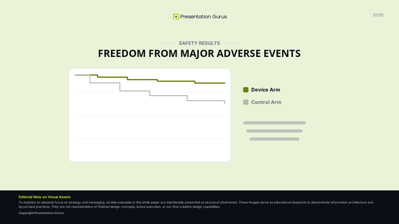
For time-to-event data (e.g., freedom from target lesion revascularization), Kaplan-Meier survival curves are the standard. When designing Kaplan-Meier plots, always include a “Patients at Risk” table aligned directly beneath the horizontal time axis. This ensures the audience can evaluate the sample size at later time points, preventing misinterpretation of late-stage plateauing. To maintain clarity, avoid overlapping confidence interval bands; instead, display confidence intervals at discrete, key time points using clear error bars.
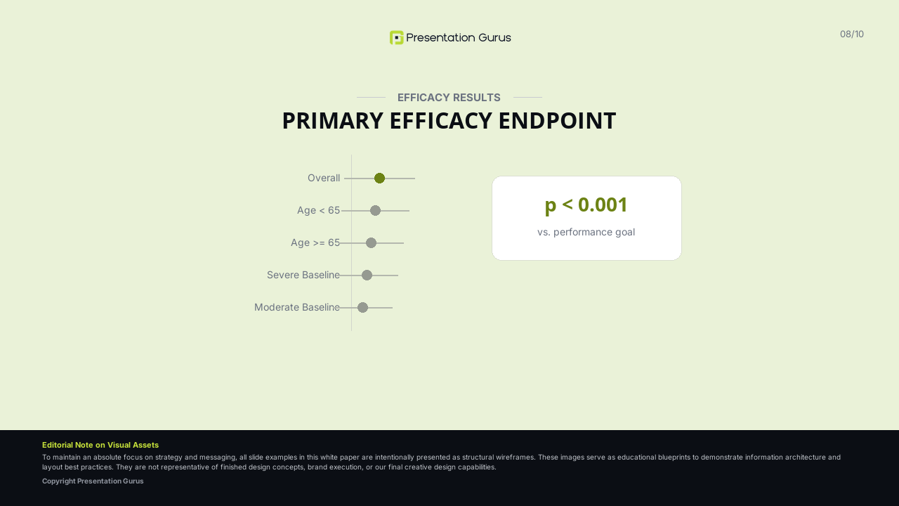
For subgroup analyses, Forest plots are the most effective visual tool. Design Forest plots with a clearly marked vertical line of unity (indicating no difference between treatment and control) and display individual hazard ratios or odds ratios as points, with horizontal whiskers representing 95% confidence intervals.
Safety data, typically presented in tables of Adverse Events (AEs) and Serious Adverse Events (SAEs), must be structured for rapid scanning. Use structured grids with light horizontal borders rather than heavy black boxes. Implement subtle, desaturated background shading (such as a light gray or soft blue tint) to highlight rows containing statistically significant differences in AE rates between the investigational and control cohorts. Never shrink table text below 12pt; if the safety data is too vast, truncate the table to display only adverse events occurring above a pre-defined threshold (e.g., >2% frequency) and provide the full dataset in the appendix.
Conclusion: Ethical Reporting and Compliance in Presentation Design
Ultimately, the effectiveness of a medical device clinical trial presentation relies on its adherence to ethical communication and regulatory standards. Presentation design is not merely an aesthetic choice; it is a mechanism for maintaining scientific objectivity. Presenters must resist the temptation to obscure negative data, under-report adverse events, or overstate secondary outcomes. All data visualizations must be constructed with honest, non-truncated axes, balanced scales, and clear disclosures of sample sizes.
By combining disciplined cognitive design, rigorous statistical visualization, and a transparent narrative structure, presenters can deliver a clinical trial deck that respects the intelligence of their audience, aligns with stringent regulatory expectations, and builds lasting scientific credibility for the medical device.

Ready To
Get Started?
Tell us a little about your project below and we’ll follow up the same day with next steps.
Presentation Gurus is open. Give us a call. We actually answer the phone.
+1 (480) 386-6000How-To Guide: Developing a Medical Device Clinical Trial Presentation
The ten steps below walk through building a complete sample deck for “Clinical Trial Results for [Investigational Medical Device],” slide by slide. Each step is annotated with what it needs to accomplish, the design decisions behind its layout, and an operational note on presenting it in the room.
Slide 1 — Title and Presenter Disclosures
The introductory slide establishes the formal identity of the presentation, identifies the presenters, and declares any financial, professional, or institutional conflicts of interest.
Topics to discuss:
- Official trial name, acronym, and registration identifier (e.g., ClinicalTrials.gov NCT number).
- Full names, academic credentials, and institutional affiliations of the presenting author(s).
- Formal disclosure of potential conflicts of interest, funding sources, and study sponsor details.
Design best practices:
- Use a clean, high-contrast layout with a prominent title in bold, sans-serif typography (36–40pt).
- Structure disclosures clearly using a simple, multi-column list rather than a dense block of text.
- Limit decorative elements to a single, high-quality corporate or academic logo to maintain professional authority.
Operational note: Disclosure statements are a mandatory regulatory requirement for continuing medical education (CME) and major clinical congresses. Ensure they are displayed long enough to be read.
Slide 2 — The Unmet Clinical Need and Disease State
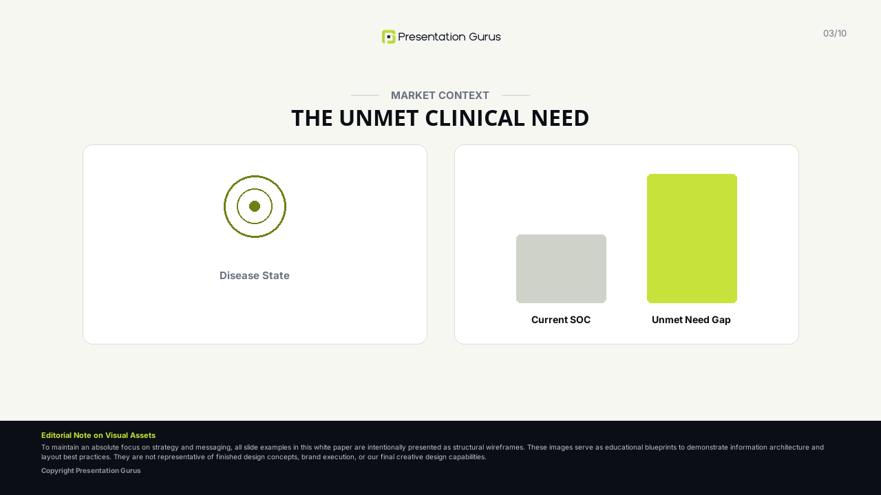
This slide frames the clinical context by outlining the target disease or condition, detailing current diagnostic or therapeutic limitations, and establishing why a new medical device intervention is necessary.
Topics to discuss:
- Epidemiological data, prevalence, and socio-economic burden of the target disease state.
- Limitations of the current standard of care (e.g., high failure rates of pharmacotherapy, invasiveness of existing surgeries).
- The specific clinical gap or unmet need that the investigational medical device is designed to address.
Design best practices:
- Utilize a visually striking, high-contrast layout to command early audience attention.
- Use large, bold callout numbers (e.g., 60–72pt) for key epidemiological figures, paired with concise descriptive text.
- Integrate high-quality medical illustrations or anatomical schematics to visually explain the pathology of the disease.
Operational note: Avoid overly graphic clinical images that may distract or cause discomfort to a mixed audience. Focus on clear, stylized anatomical schematics.
Slide 3 — The Technology: Device Description and Mechanism of Action
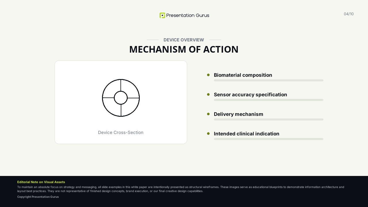
This slide introduces the investigational medical device, detailing its physical characteristics, engineering parameters, and direct biological or physiological mechanism of action (MoA).
Topics to discuss:
- Physical description of the device (materials, size, unique engineering features).
- Step-by-step description of how the device is deployed, implanted, or operated.
- The physiological, biological, or mechanical mechanism through which the device treats or diagnoses the condition.
Design best practices:
- Feature high-resolution, professionally photographed images of the device on a clean, neutral background.
- Use annotated callouts with thin, elegant pointer lines to label key components or functional zones of the device.
- Consider using a brief, high-quality 3D render or a simplified sequential diagram to show the device’s mechanism of action in situ.
Operational note: Ensure that any technical or engineering jargon is translated into clear clinical terminology, emphasizing how the engineering features map directly to clinical benefits.
Slide 4 — Trial Design, Study Flow, and Methodology
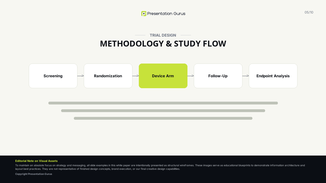
This slide maps the scientific blueprint of the trial, outlining the protocol structure, key inclusion/exclusion criteria, follow-up intervals, and patient progress using a standard CONSORT layout.
Topics to discuss:
- Core trial architecture (e.g., prospective, randomized, multicenter, double-blind, active-controlled, non-inferiority).
- Summary of key inclusion and exclusion criteria.
- The patient journey, utilizing a CONSORT flow diagram tracing enrollment, randomization, follow-up, and final analysis.
Design best practices:
- Construct a simplified CONSORT flow diagram using clean, distinct rectangular boxes and clear directional arrows.
- Use a subtle background tint or accent color to highlight the final analyzed cohort, distinguishing it from excluded subjects.
- Present key eligibility criteria using a balanced, two-column layout with clear bullet points, avoiding dense blocks of text.
Operational note: Be prepared to justify any significant patient dropouts, explants, or protocol deviations. Transparency here builds essential credibility with regulatory bodies.
Slide 5 — Patient Demographics and Baseline Characteristics
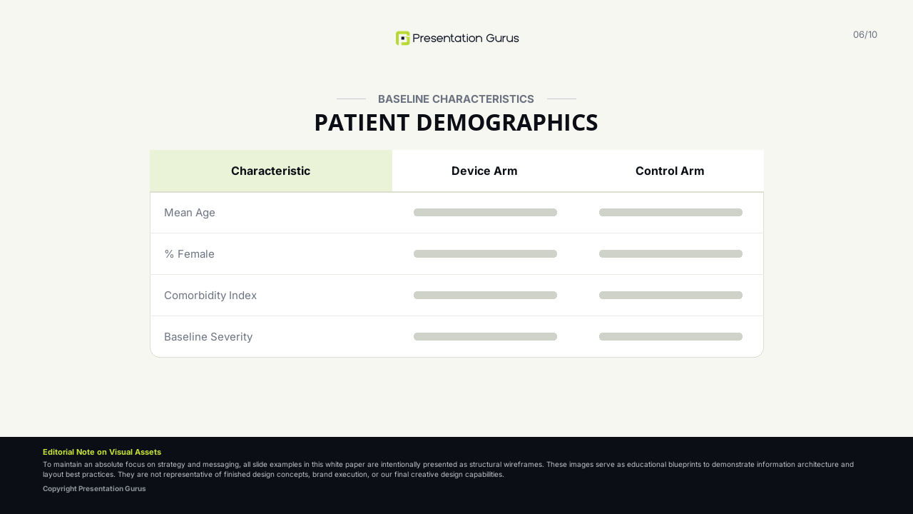
This slide presents the baseline clinical and demographic profile of the trial cohorts, demonstrating that the treatment and control arms were well-matched and representative of the target patient population.
Topics to discuss:
- Standard demographic parameters (e.g., age, sex, ethnic distribution).
- Baseline disease severity metrics, anatomical characteristics, and relevant comorbidities.
- Statistical validation of baseline balance between cohorts (e.g., p-values indicating no significant pre-treatment differences).
Design best practices:
- Present data using a clean, structured table with light horizontal row dividers instead of heavy black borders.
- Align numbers to the decimal point to ensure they are easy to scan.
- Use a subtle, desaturated background tint on alternating rows (zebra striping) to assist horizontal reading of multi-column tables.
Operational note: If significant baseline imbalances exist between cohorts, address them proactively and explain how they were adjusted for in the statistical analysis.
Slide 6 — Primary Efficacy Endpoint Results
The most critical slide in the deck, this presents the definitive statistical results for the study’s primary efficacy endpoint, determining whether the trial achieved its primary scientific hypothesis.
Topics to discuss:
- Definition of the primary efficacy endpoint (e.g., rate of target lesion failure at 12 months).
- The formal trial hypothesis (e.g., superiority or non-inferiority margin) and its outcome.
- Primary statistical results, including raw event rates, relative risk, absolute differences, confidence intervals, and p-values.
Design best practices:
- Dedicate this slide to a single, high-impact data visualization (e.g., a Kaplan-Meier curve or a high-contrast bar chart).
- If using a Kaplan-Meier plot, always include a “Patients at Risk” table aligned directly beneath the horizontal time axis.
- Place key statistical values (e.g., ‘p < 0.001’ or ‘95% CI’) in a large, high-contrast, easily readable font near the chart’s focal point.
Operational note: Never truncate or manipulate axes to exaggerate differences. Keep all graphical scales honest, mathematically balanced, and clearly labeled.
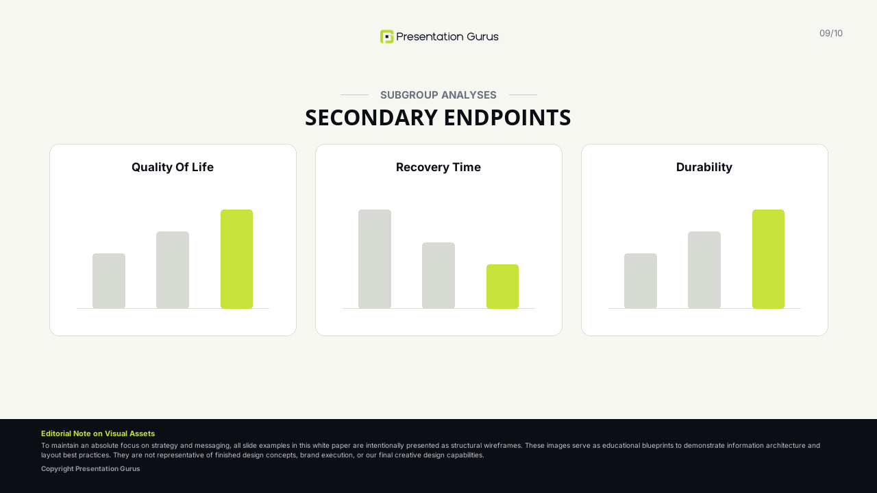
Slide 7 — Secondary Efficacy Endpoints and Subgroup Analyses
This slide details the secondary endpoints and explorer subgroup analyses, providing a more comprehensive view of the device’s performance across various clinical settings and patient subpopulations.
Topics to discuss:
- Key secondary clinical endpoints (e.g., quality of life scores, functional improvement, secondary physiological biomarkers).
- Subgroup analyses showing device performance across different demographic or anatomical segments (e.g., age groups, anatomical sizes, comorbidities).
- Discussion of whether these findings are exploratory or powered for statistical significance.
Design best practices:
- Use a Forest plot to represent subgroup analyses, plotting individual point estimates and 95% confidence intervals relative to a line of unity.
- Group related secondary endpoints into distinct, clearly labeled visual blocks or panels.
- Use consistent accent colors to link specific cohorts across both the primary and secondary results slides.
Operational note: Be careful to clearly label exploratory subgroup analyses as such to avoid over-interpreting non-powered secondary endpoints.
Slide 8 — Safety Profile and Serious Adverse Events
This slide provides a transparent, detailed disclosure of the device’s safety profile, highlighting all adverse events (AEs), serious adverse events (SAEs), and device-related complications encountered during the study.
Topics to discuss:
- Overall safety rates, including all-cause mortality, device-related deaths, and major device complications.
- Comparative incidence of specific Adverse Events (AEs) and Serious Adverse Events (SAEs) between cohorts.
- Classification of events by severity, timing of occurrence, and adjudicating committee (e.g., Clinical Events Committee) determinations.
Design best practices:
- Present adverse event rates in a structured safety table, ordering events from highest to lowest frequency.
- Use a light, desaturated red or orange background tint to highlight rows with statistically significant safety differences.
- Ensure text remains legible by avoiding font sizes below 12pt; break the table into two columns or multiple slides if necessary.
Operational note: Regulatory bodies and clinical peers will review safety data with extreme scrutiny. Presenting adverse events with complete, unvarnished transparency is essential for building scientific trust.
Slide 9 — Clinical Interpretation and Discussion
This slide synthesizes the trial findings, translating statistical efficacy and safety data into clinical context and discussing how these results compare to historical controls or current standard-of-care treatments.
Topics to discuss:
- Contextualization of the trial results within the broader, existing clinical literature.
- The practical, clinical implications of the findings (e.g., reduced hospitalization times, simplified procedures, improved quality of life).
- Balanced discussion of study limitations (e.g., short follow-up duration, single-blind nature, small sample size in specific subgroups).
Design best practices:
- Avoid dense paragraphs of text; instead, present key discussion points in 3–4 structured, well-spaced bullet points.
- Use bold lead-in phrases for each bullet point to allow the audience to scan the slide quickly and grasp the main takeaways.
- Incorporate a simple side-by-side comparative table if comparing trial outcomes with historical controls or landmark trials.
Operational note: Avoid overclaiming success. Acknowledging limitations in a professional, objective manner demonstrates scientific maturity and reinforces the credibility of the presented data.
Slide 10 — Conclusions and Next Steps
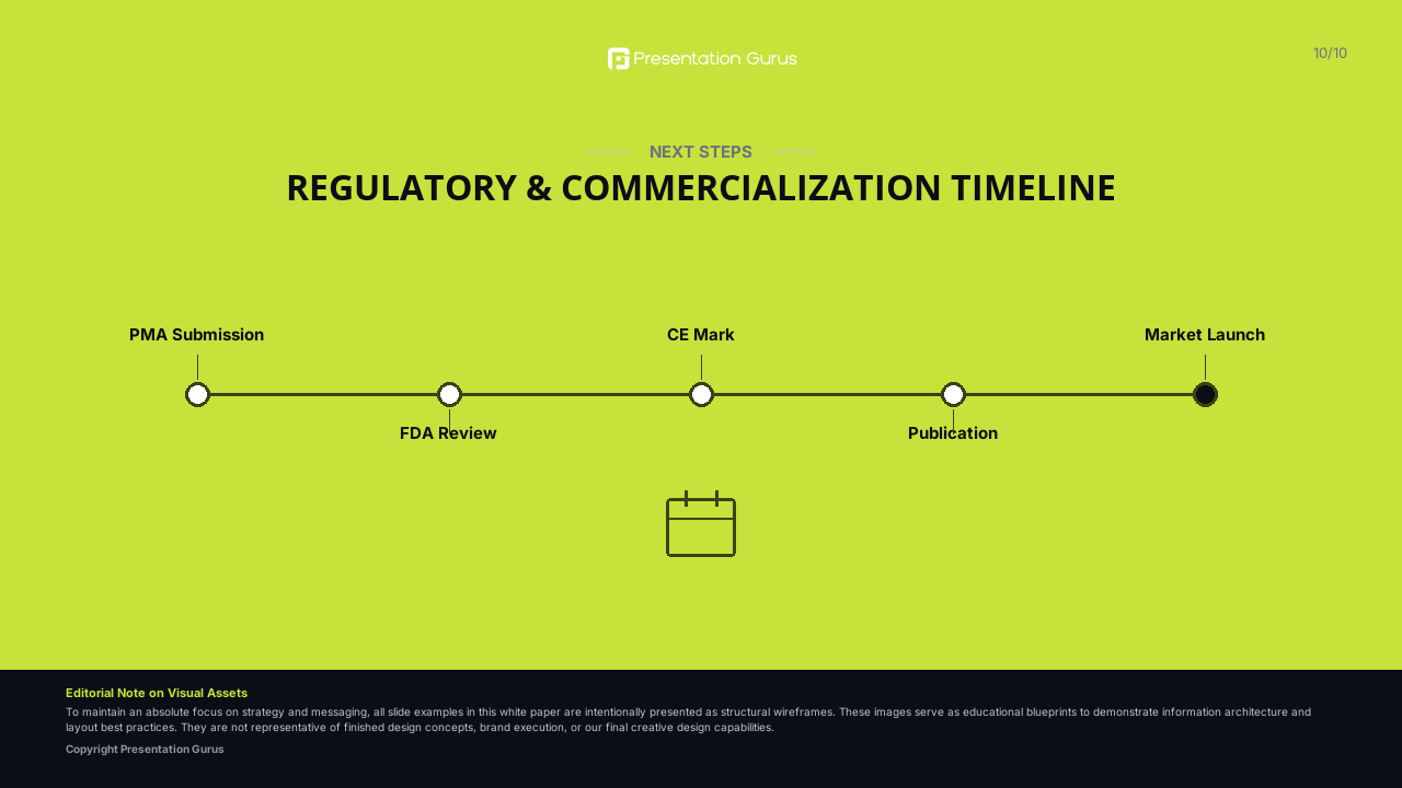
The final slide summarizes the core takeaways of the trial and outlines the clinical, regulatory, or developmental path forward for the medical device.
Topics to discuss:
- Concluding summary of the device’s clinical efficacy, safety profile, and overall benefit-risk ratio.
- The anticipated path forward, such as planned regulatory filings (FDA, CE Mark), upcoming registry studies, or next-generation device iterations.
- Final closing remarks, acknowledgments of participating sites, investigators, and the patients who participated in the trial.
Design best practices:
- Ensure the slide is highly clean and uncluttered, leaving a lasting, professional impression on the audience.
- Present the final, high-level conclusion as a single, prominent, centered statement in bold typography (24–28pt).
- Include a clear call to action or contact information for follow-up inquiries, along with a final slide-appropriate visual if desired.
Operational note: Ensure that the concluding statements strictly align with the trial data presented in the preceding slides without introducing new claims or extrapolations.